Modernizing Blizzard’s command and control platform
Enterprise-grade SaaS platform
Product Design
UX Design
User Research
UI Design
Branding
Identity
Graphic Design
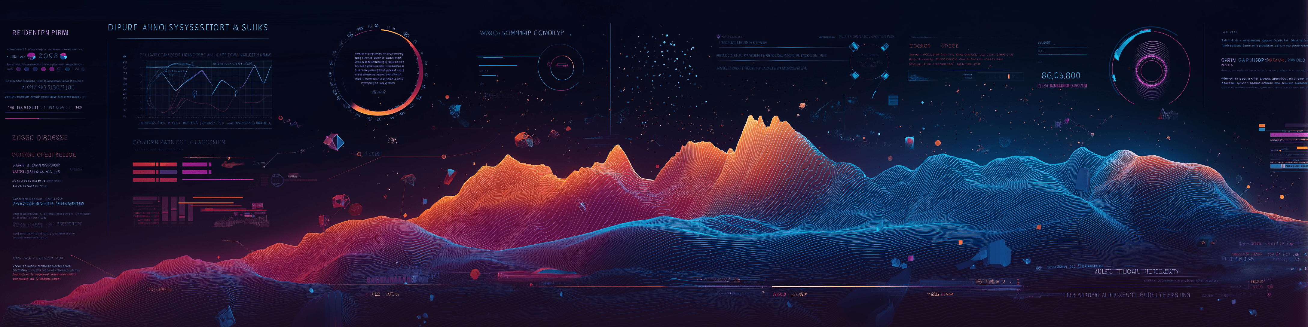
Modernizing Blizzard’s command and control platform
Context
Overview
After more than two decades in service, Blizzard Entertainment’s legacy Command & Control platform had reached a critical point. Like many long-standing systems, years of incremental updates and technical debt had taken their toll. This technical debt created real‑world pain: incident mitigation dragged on, tribal knowledge ruled day‑to‑day operations, and onboarding new engineers took weeks instead of days. Its dated architecture and usability issues no longer met the demands of modern global infrastructure at scale for a giant in the gaming industry.
With growing complexity in server orchestration and the evolving needs of 200+ global SREs, it was time to rethink the platform from the ground up by modernizing the architecture, streamlining workflows, and delivering a purpose-built experience optimized for speed, observability, and fine-grained control that reflected the dynamic and evolving needs of today’s operations.
Challenge
The Problem
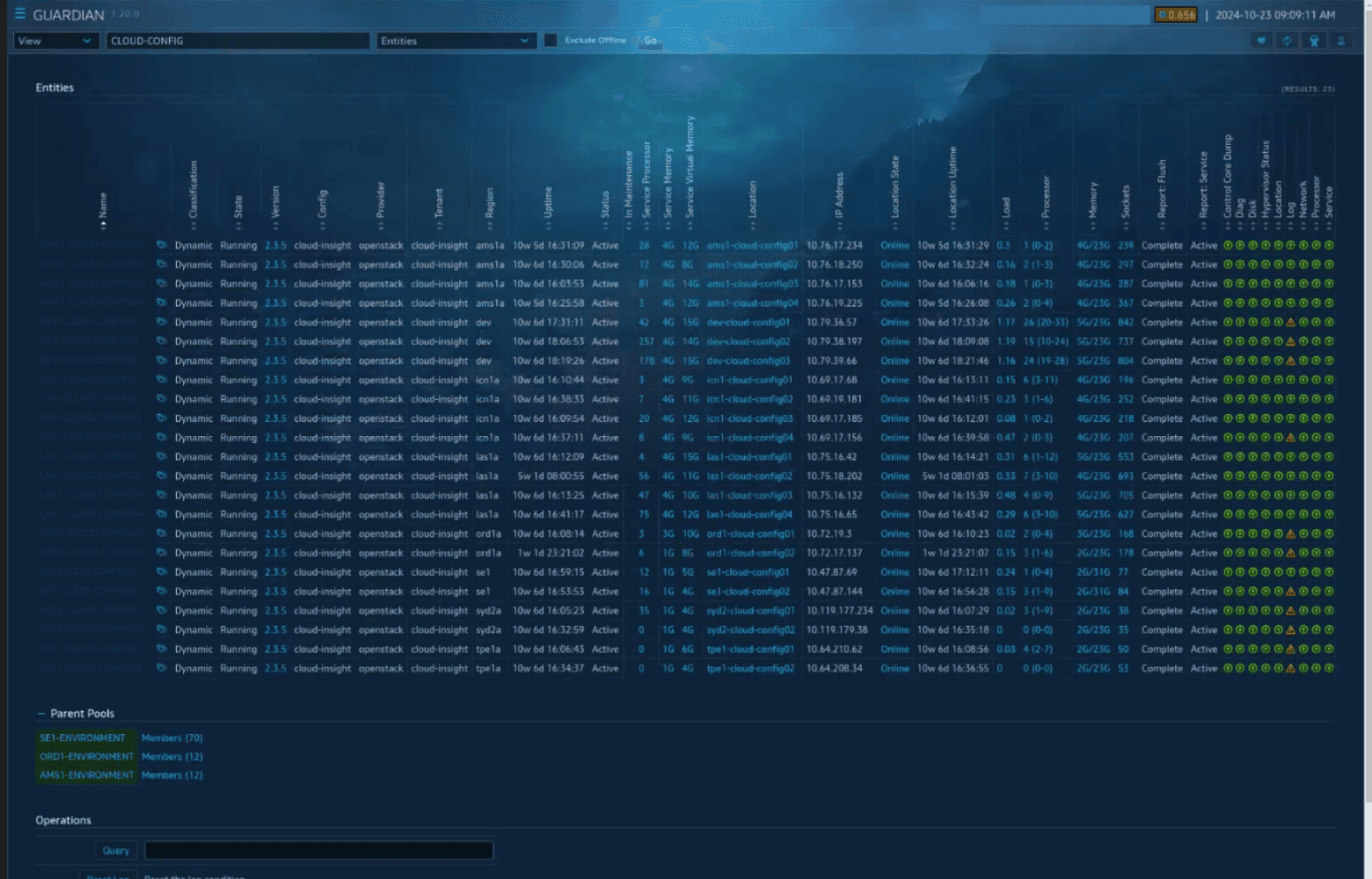
The legacy tool was fragmented, inconsistent, and lacked the scalability needed for modern cloud operations. SREs were losing efficiency to disjointed workflows, outdated UI patterns, and redundant tooling. Re‑platforming a mission‑critical system while millions of players depended on uninterrupted service required zero‑downtime migration and uncompromising reliability. Data models, workflows, and mental models all had to change without breaking live games.
Goals
The Solution
The goals for the C2 platform were defined early through close alignment with both stakeholders and SREs. They reflected a need for a highly performant, intuitive, and resilient interface that could support modern infrastructure demands while streamlining daily operations for a globally distributed team.
We aimed to transform infrastructure interactions by:
Unify critical workflows in one platform.
Lower cognitive load during high-stakes work.
Deliver lightning-fast search and discovery.
Support safe batch and single-item actions.
Establish a reusable design system for growth.
Data
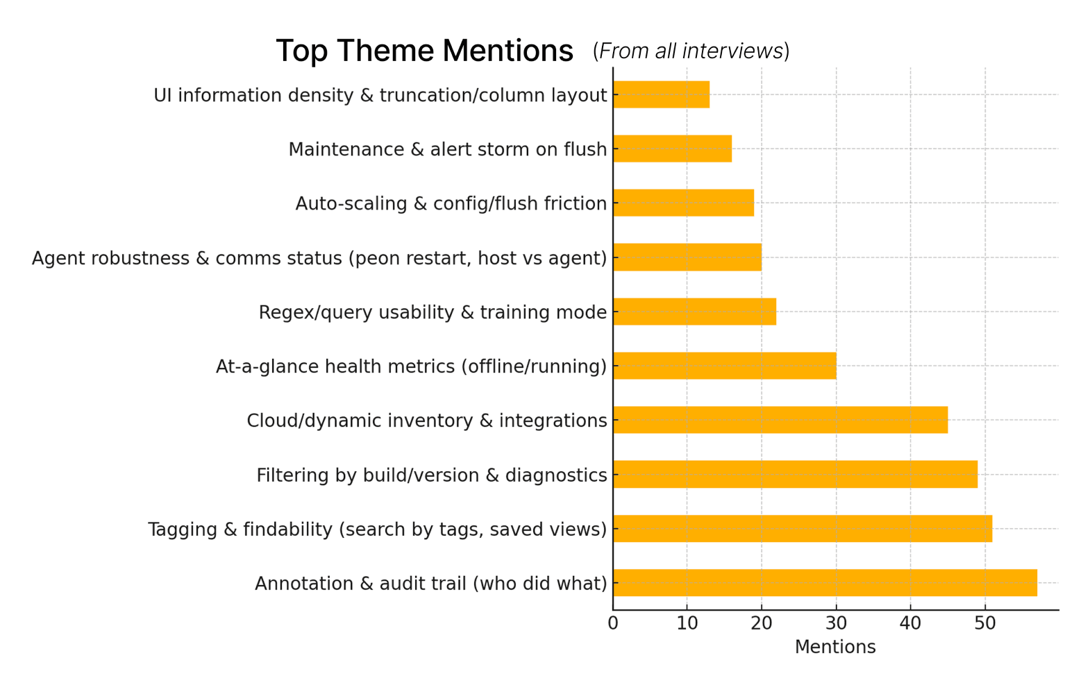
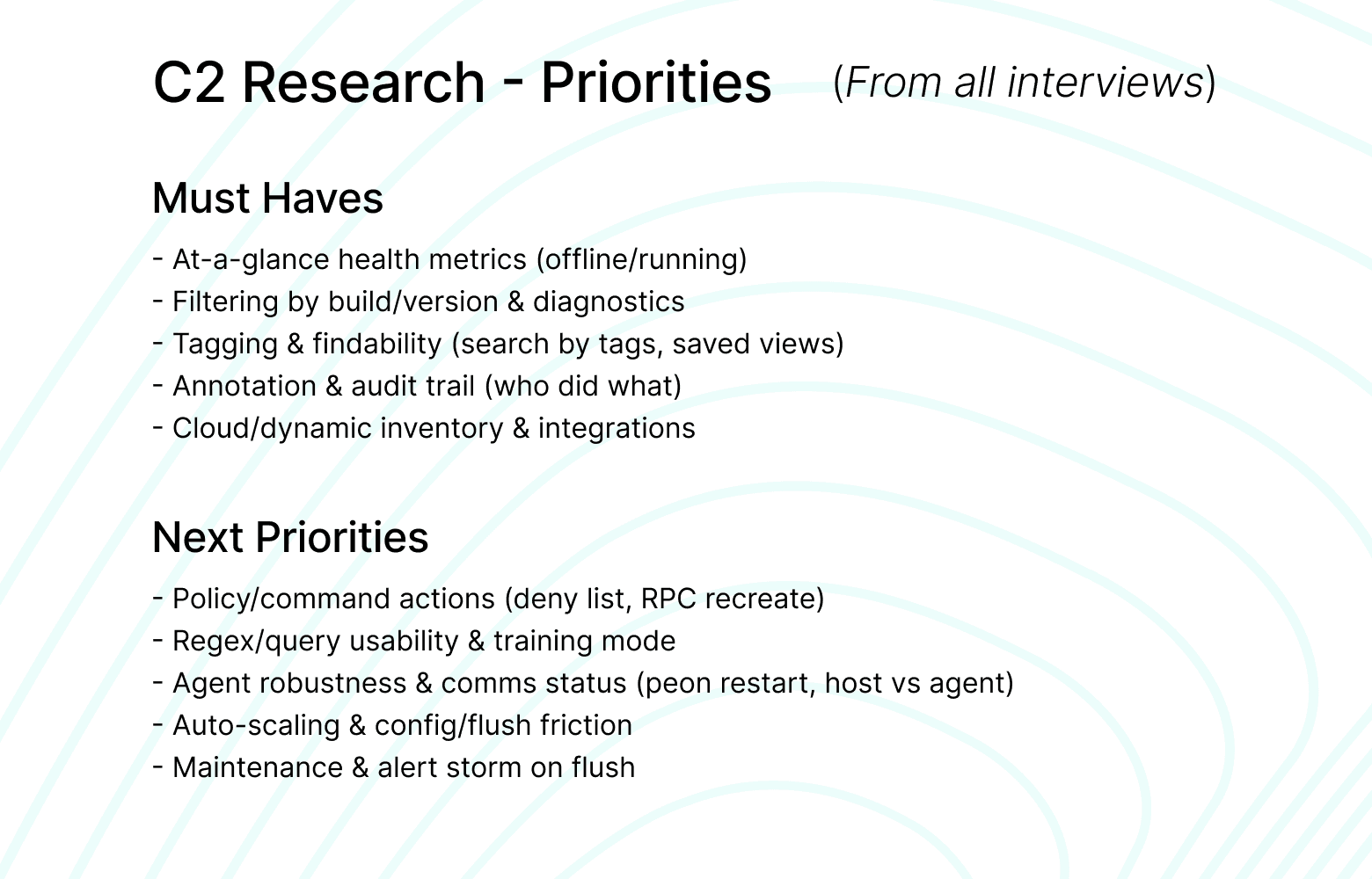
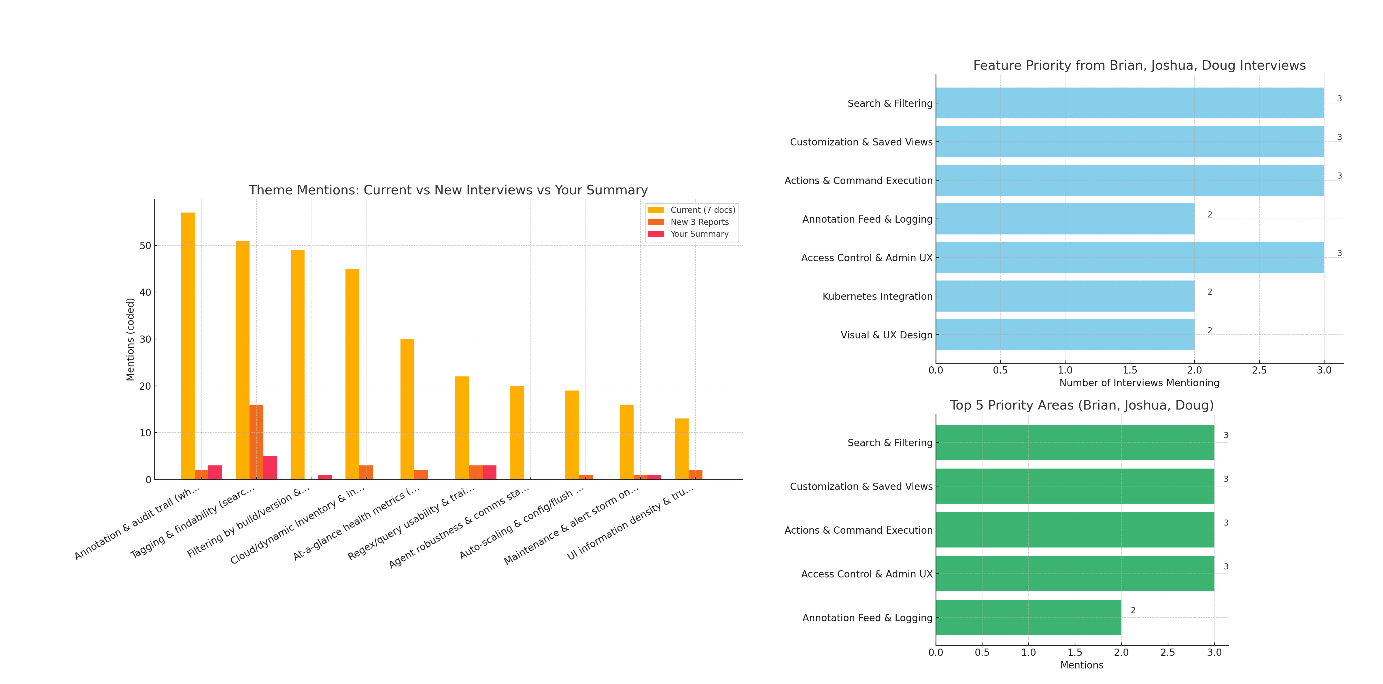
Research Insights
To guide foundational design decisions, I conducted user research with SREs and other key stakeholders across Blizzard’s global infrastructure teams. These sessions surfaced recurring pain points and clear opportunities that shaped our design strategy.
These insights highlighted crucial needs:
Search drives action, not the other way around.
Labels and regex matter to power users.
Batch actions need explicit guardrails and clear rollbacks.
Saved views reduce scramble during incidents.
Access rules need transparency and feedback.
Data-dense screens need firm hierarchy and placement.
Strategy
Approach
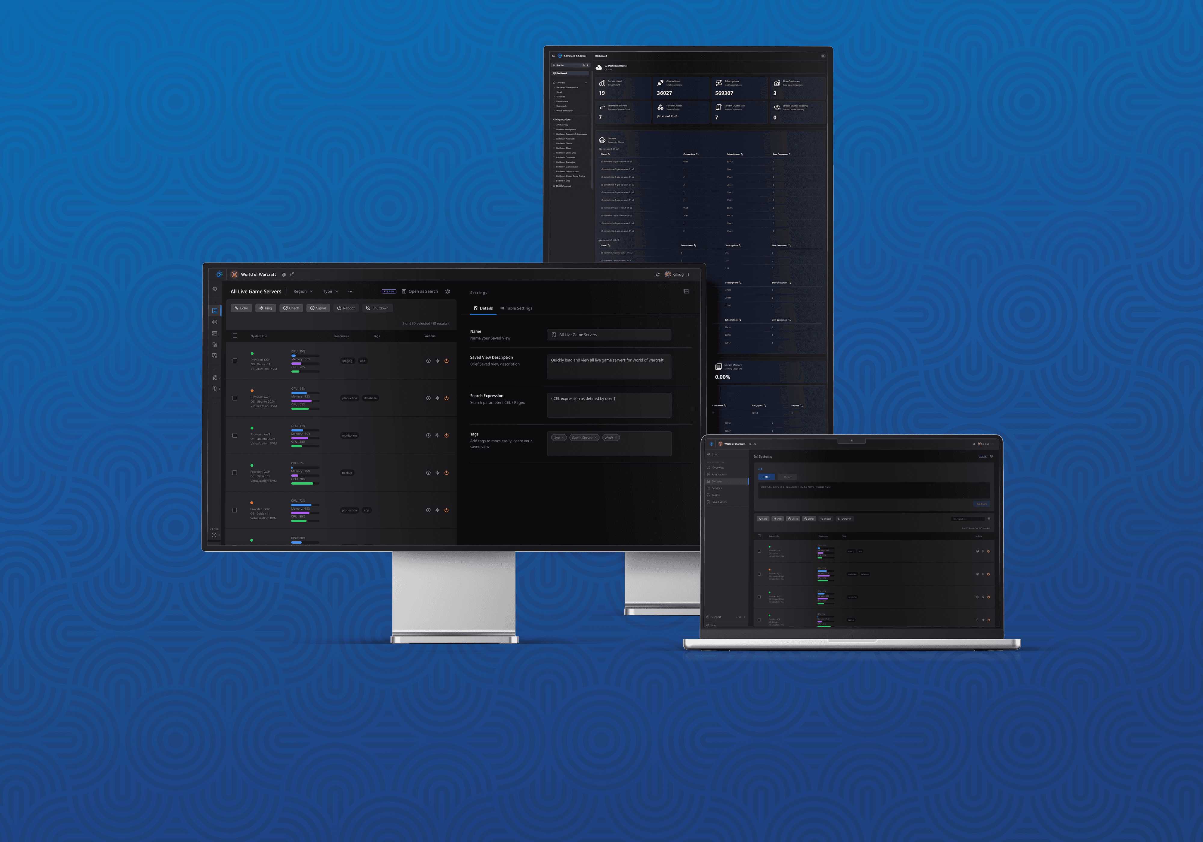
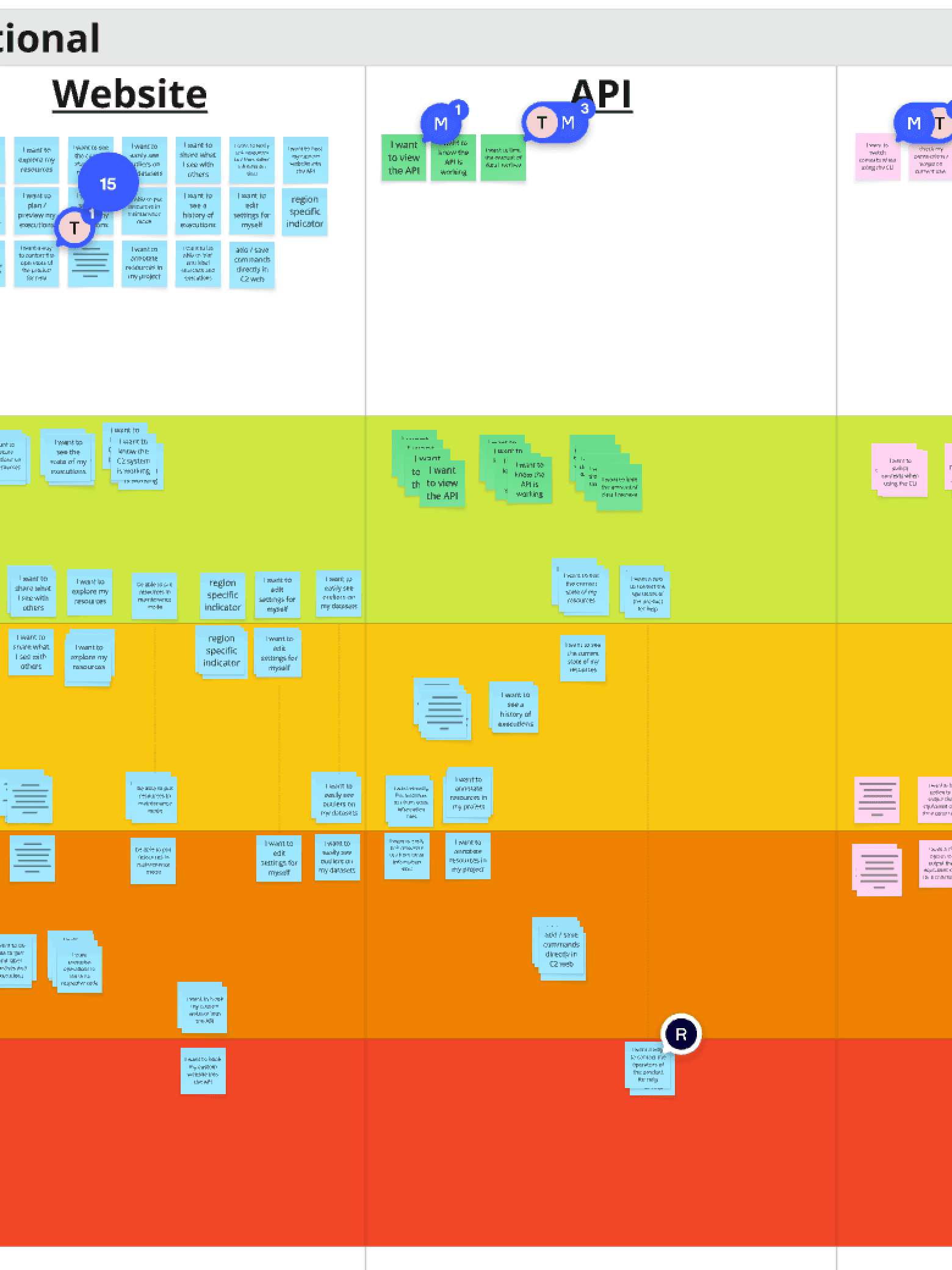
We approached the redesign by grounding all decisions in real user feedback. I started by mapping Guardian’s existing workflows, aligning user pain points with opportunities in the new architecture. Collaborating closely with engineering and product teams, we adopted Nuxt.UI for rapid build out, ensuring continuity between design and development. Early design iterations included intuitive drag-and-drop elements, pinning capabilities, and inline annotations, regularly validated through user and stakeholder feedback.
Conduct an audit of the legacy system to identify pain points and workflow inefficiencies
Prioritize user needs through remote interviews and collaborative journey mapping
Adopt Nuxt.UI to accelerate development and maintain consistency across components with minimal customization
Facilitated stakeholder alignment via ongoing design critiques and bi-weekly demos
Design
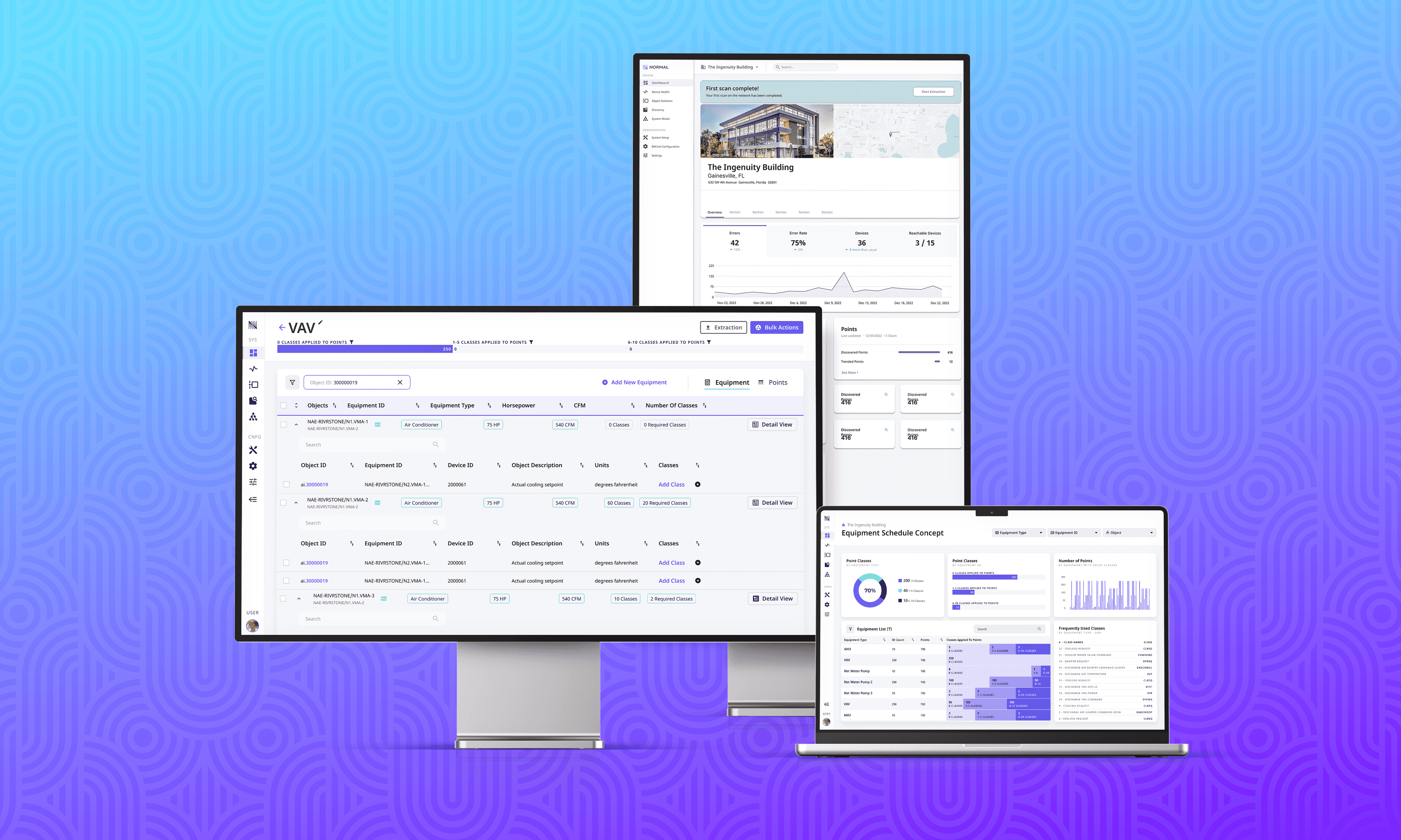
Process
With priorities clear from research and a shared vision in place, I led a highly iterative design process:
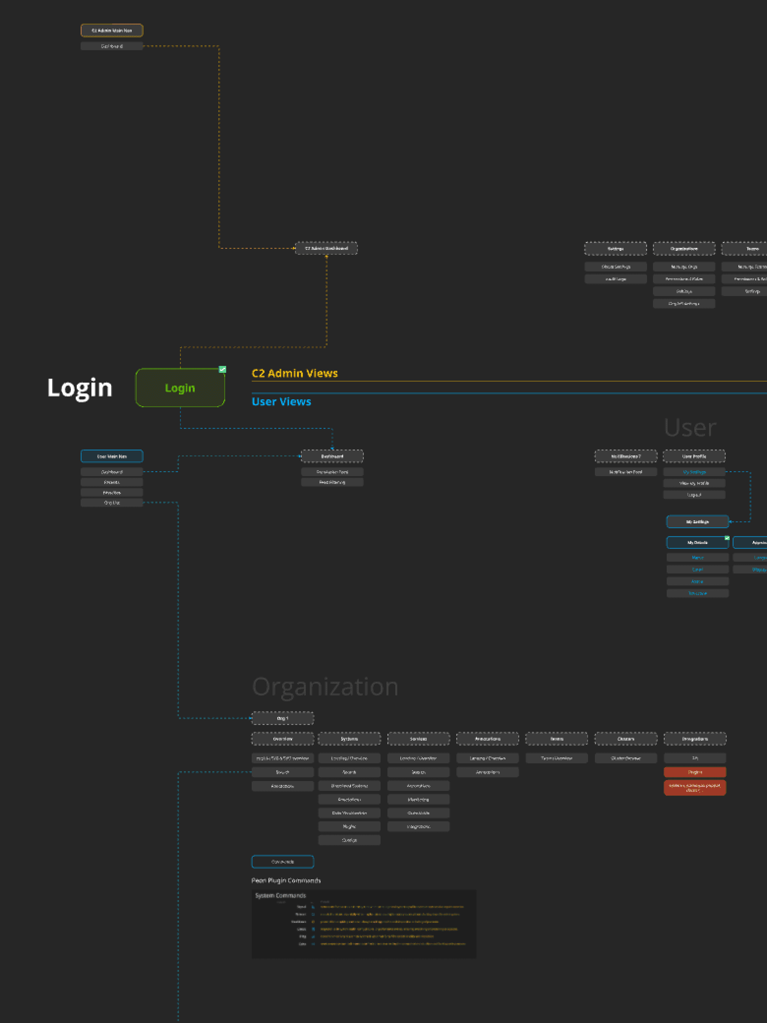
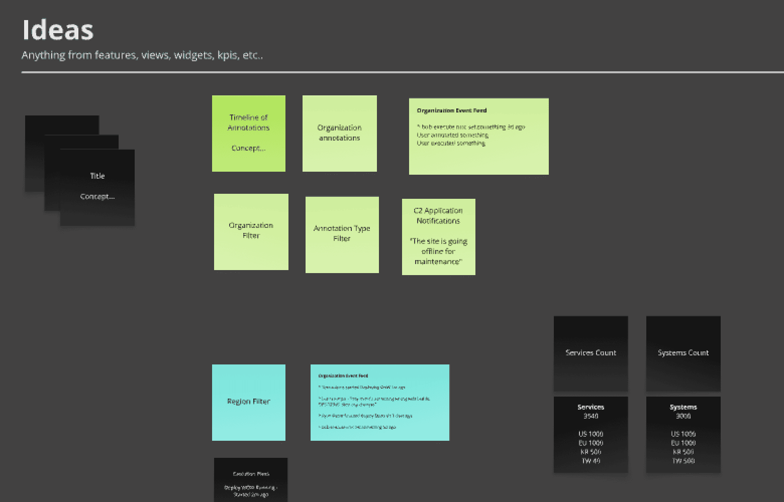
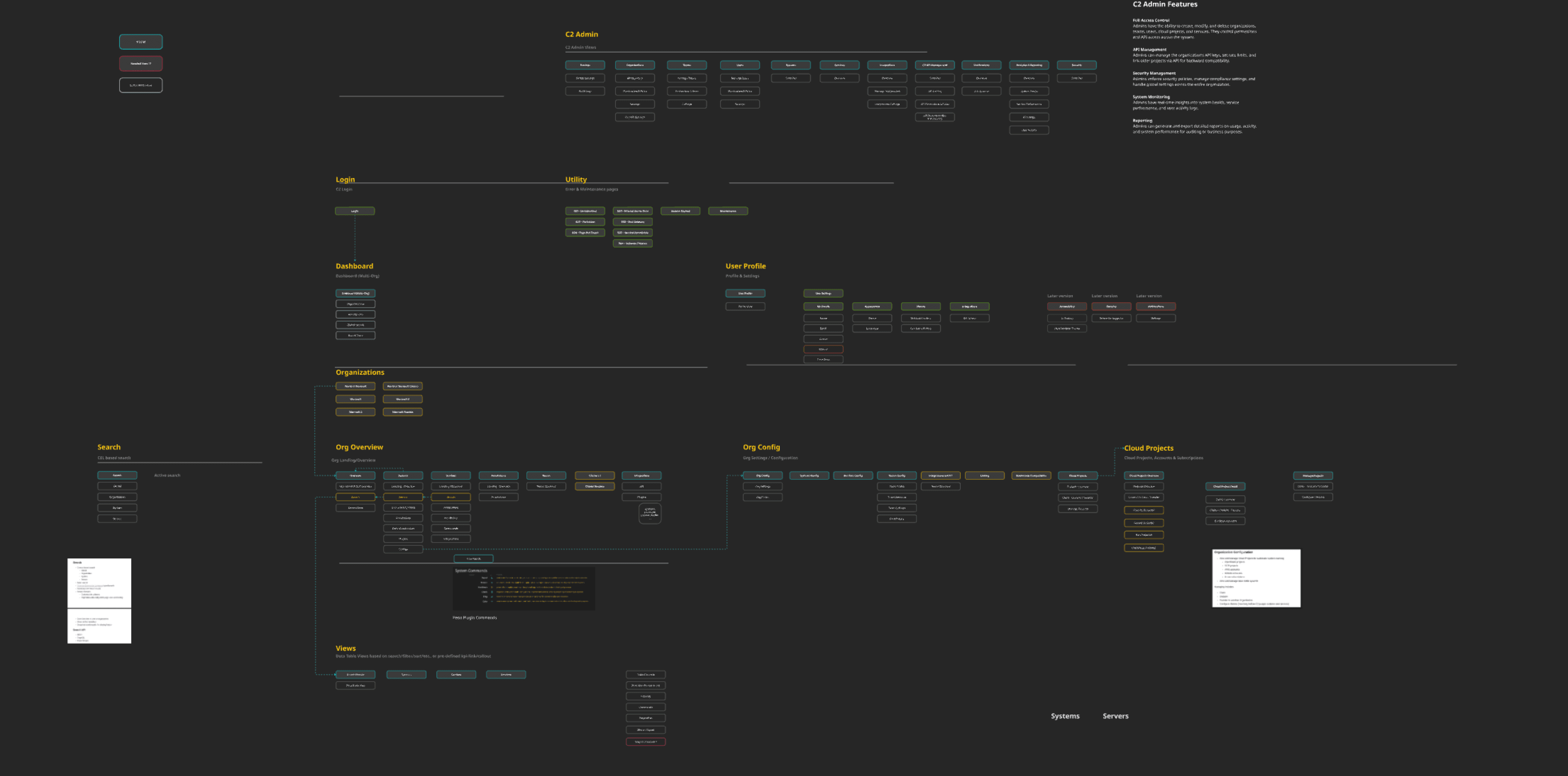
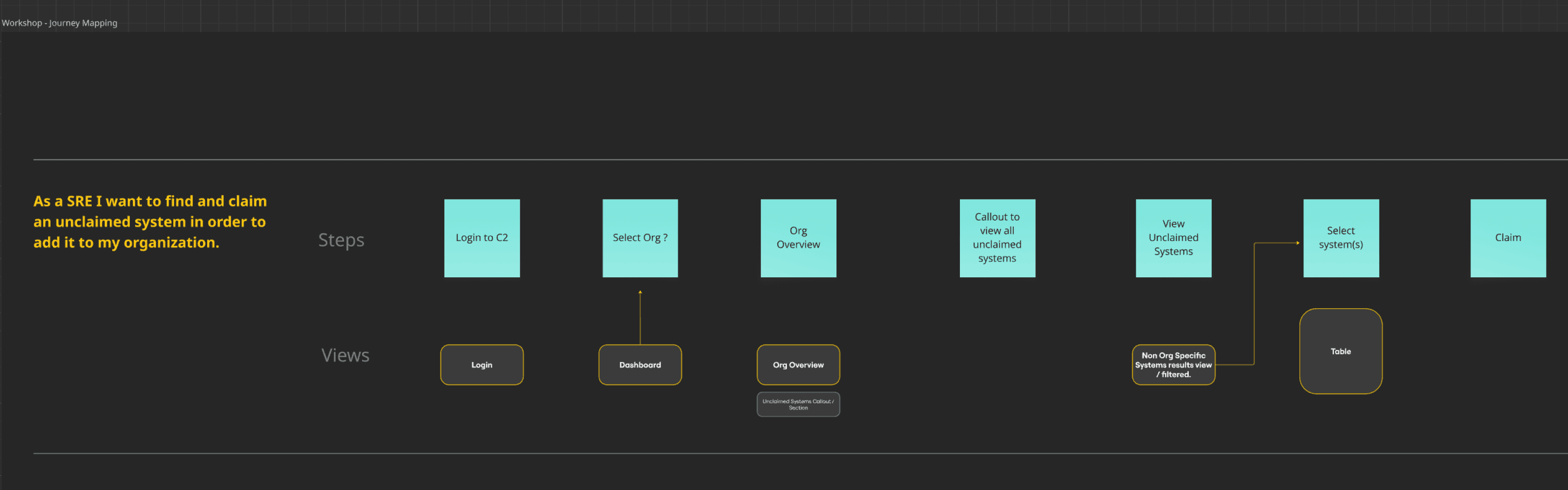
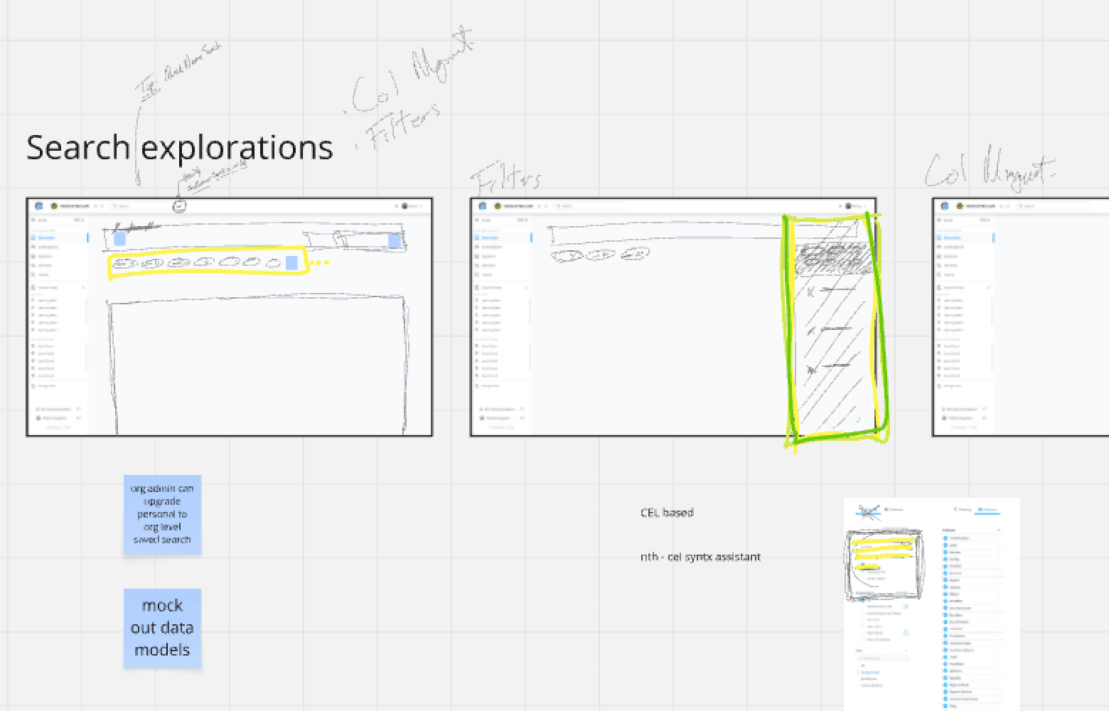
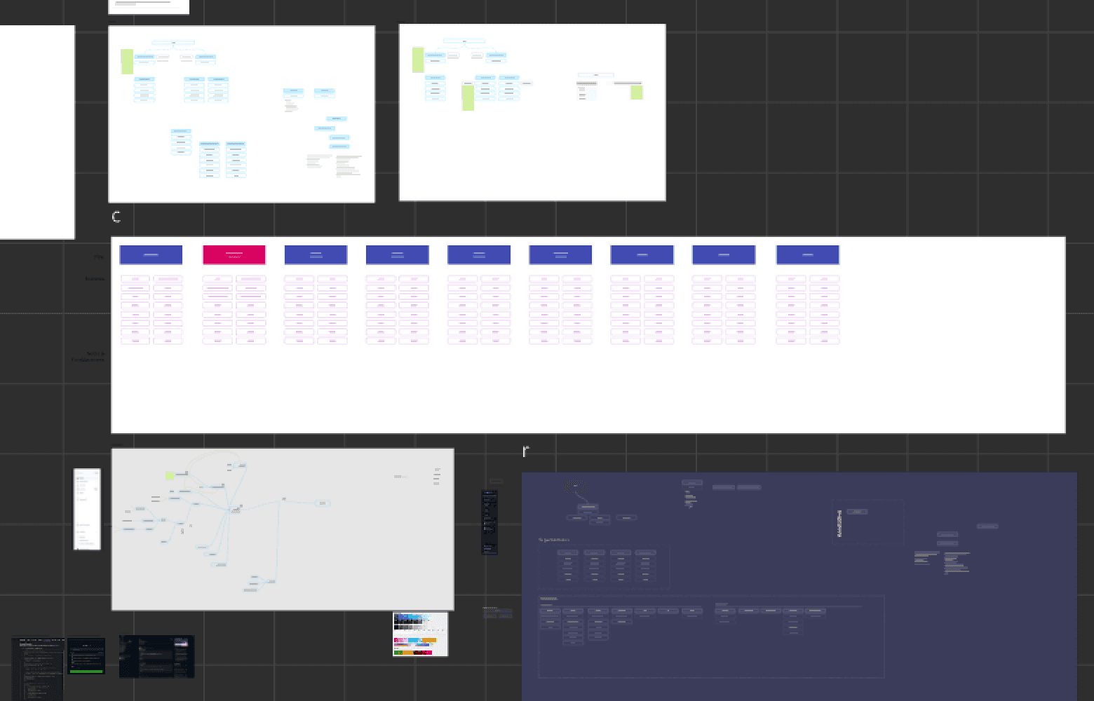
Built interactive Figma prototypes with progressive detail
Created system maps to reflect unified infrastructure operations
Developed a flexible UI with collapsible top-level components
Multiple iterations per feature based on internal review and early adopter feedback
Validation
Testing
Testing played a crucial role in shaping the platform experience, helping ensure the UI could handle real-world infrastructure complexity with minimal friction. We focused on validating not just usability, but also orientation, confidence, and speed of action across complex system layers.
To ensure usability and clarity at every stage, we validated our designs continuously with real users and stakeholders:
Scenario-based walkthroughs with early adopters.
Focus on deep navigation, batch execution, and undo.
Measure time to action, error discovery, and recovery clarity.
Refine labels, defaults, and empty states.
Outcome
Impact
C2’s launch represented more than a UI facelift. It reshaped Blizzard’s operational culture. By replacing Guardian’s fragile workflows with a cohesive, data‑driven experience, C2 unlocked measurable efficiencies and set a new benchmark for internal tooling.
Key results included:
Faster path from search to execution.
Lower error rate on bulk changes during incidents.
Shorter onboarding through shared views and clearer IA.
Fewer UI defects from a shared library and tokens.
Higher trust through visible state and audit trails.
Together, these results tell a clear story: A user‑centered alliance between design, engineering, and SREs created a platform that accelerates work, reduces risk, and scales alongside Blizzard’s growing ambitions.
Appearance
Identity & Branding
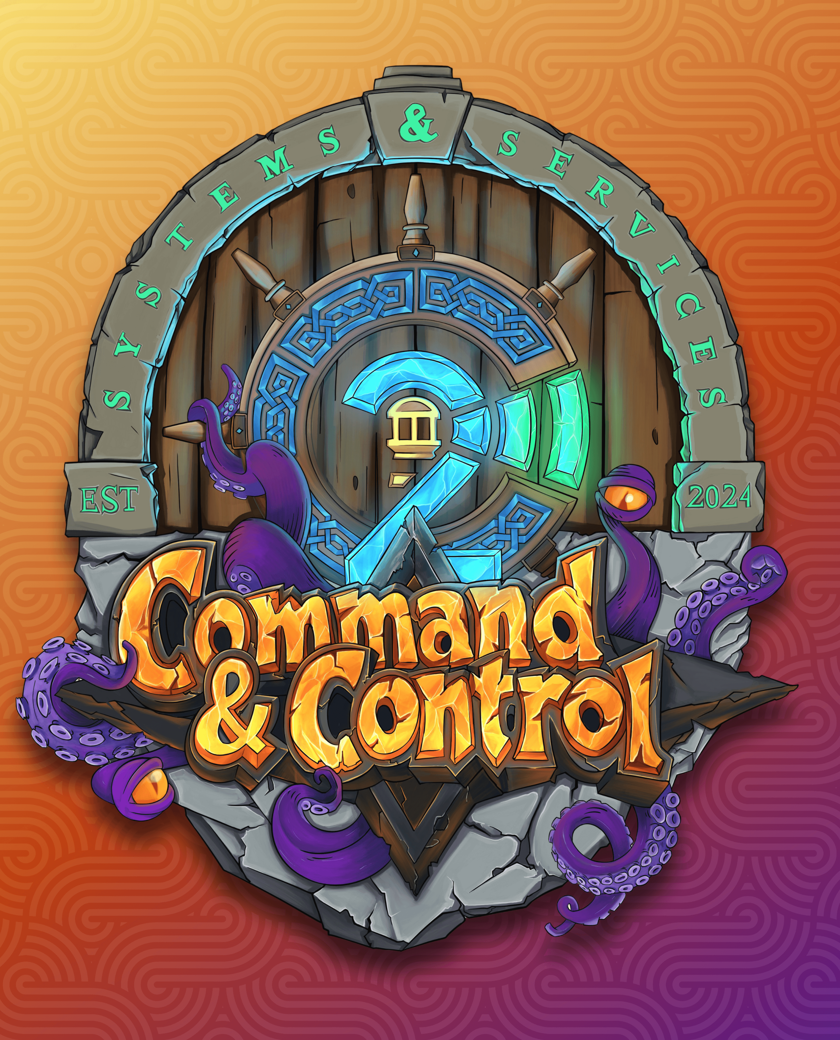
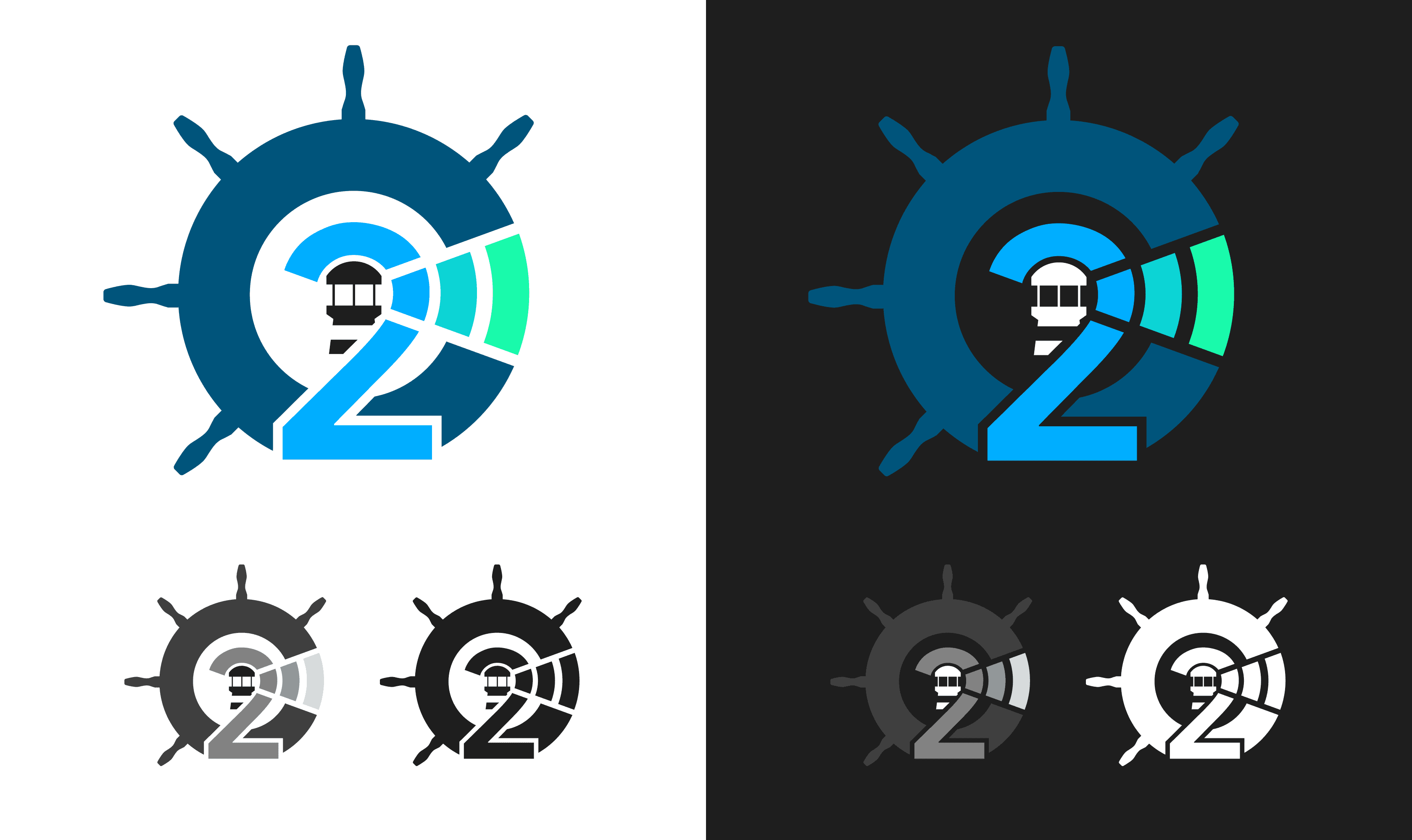
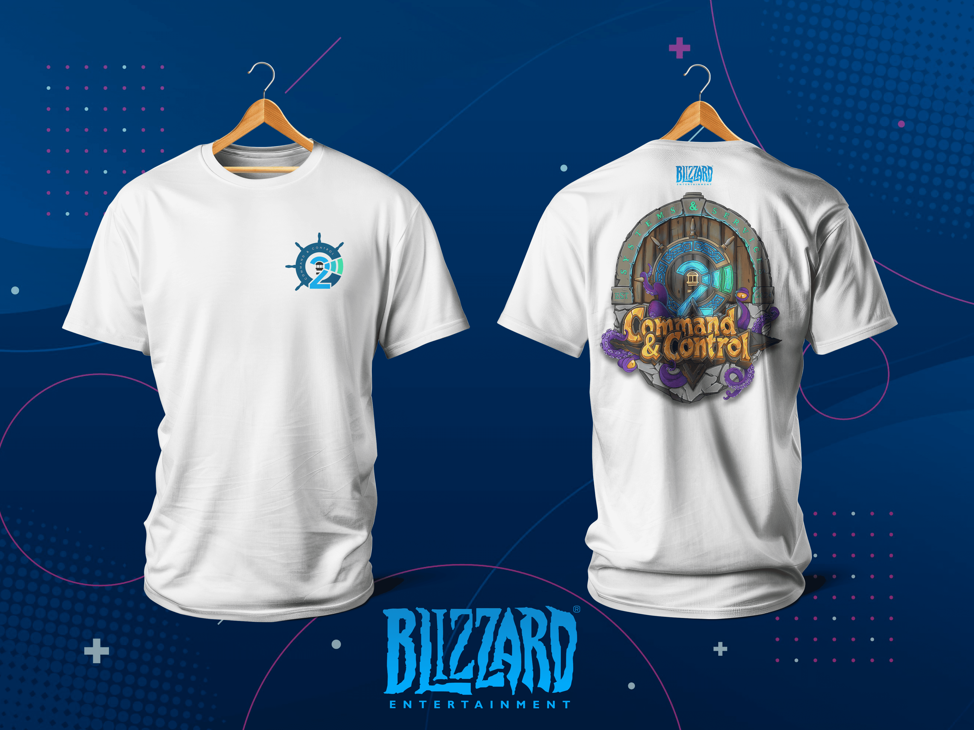
While C2 is an internal facing platform, I created a visual identity that aligned with Blizzard’s brand, elevating the perception of internal tooling. I also designed a lighthouse inspired logo mark and graphic for stickers, shirts, and mugs to help promote the product internally. This visual identity conveys strength, clarity, and purposeful design.
Created a lightweight internal design language aligned with Blizzard’s culture.
Designed a minimal color system and typography scale optimized for dark-mode dashboards and data-heavy scenarios.
Established iconography and component styling standards compatible with Nuxt.UI with minimal customization.
Lighthouse-inspired C&C logo symbolizing guidance and reliability.
Graphic for team swag (stickers, shirts, mugs, etc..) for internal promotion.
Final Thoughts
Reflection
Designing for Blizzard’s battle‑tested engineers underscored the fact that even power users crave clarity. Every decision, from regex search cues to batch‑action safeguards, had to respect their deep domain knowledge while removing unnecessary friction. Building a living component library in Nuxt.UI became our secret weapon, keeping design and engineering in alignment and letting us ship improvements at a rapid pace.
Running point on UX end‑to‑end was a crash course in multitasking: protyper at dawn, researcher by noon, and design advocate before day’s end. It was demanding, sometimes chaotic, and one of the most rewarding opportunities of my career thus far.