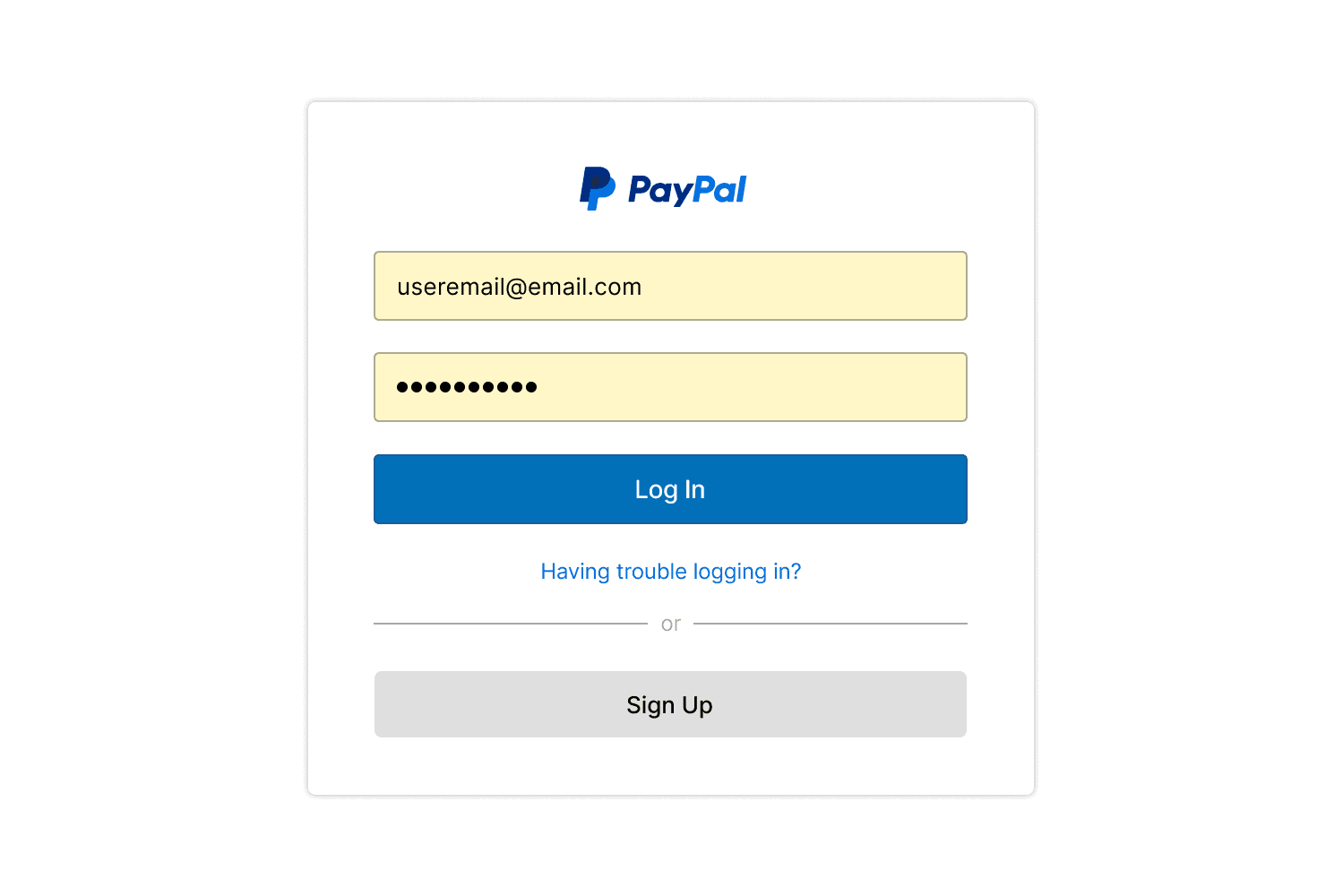
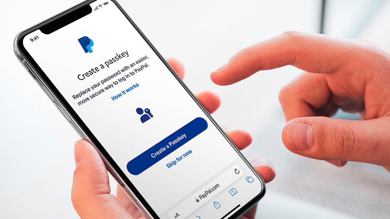
Bringing Passkeys to 460+ million users
Consumer & Enterprise Authentication
UX Design
UI Design
User Research
Mobile App
Product Design
Identity

Bringing Passkeys to 460+ million users
Context
Overview
Passwords created risk and friction. Mobile-first users expected faster, safer entry. Platform support for Passkeys made this shift feasible across Apple, Google, and major browsers. We used this moment to modernize login and raise trust across platforms.
Challenge
The Problem
Legacy login used email, password, and 2FA. Phishing and credential stuffing still slipped through. Users felt tired of codes and prompts. Passkeys reduce risk but need clear teaching, scalable fallbacks, and strong discoverability.


Goals
The Solution
This initiative was about more than simply implementing Passkeys. It was an opportunity to redefine trust, ease of access, and security across PayPal’s global identity experience. We aimed to create flows that met modern user expectations, were intuitive across devices, and built confidence in a cutting-edge but unfamiliar authentication method.
The project aimed to:
Make Passkeys a first-class sign-in.
Redesign flows for app, mobile web, and desktop.
Provide recovery for lost and new devices.
Align with FIDO, Apple, and Google patterns.
Meet WCAG AA, legal, and regional standards.
Build confidence through simple language and timing.
Data
Research Insights
To design for trust in an unfamiliar paradigm, we had to understand not only user behavior, but also how users felt about identity. Research was focused on reducing fear of the unknown while ensuring users weren’t overwhelmed by technical jargon or security concerns. Through a mix of internal audits, competitive benchmarking, and language testing, we uncovered key behaviors, expectations, and hesitations that shaped both UI and flow strategy.
Working closely with product and compliance teams, I audited existing login flows and reviewed usage patterns across devices. We:
Audited current login flows and metrics.
Benchmarked Apple, Google, and early adopters.
Tested naming, timing, and prompts with Research.
Users preferred opt-in with clear benefit statements.
Mobile flows needed stronger visual affordances.
Edge cases mattered more than expected volume.
Strategy
Approach
We approached this as a systems-level design problem, not just a screen-by-screen redesign. Starting with user journeys and platform-specific capabilities, we aligned technical constraints with UX opportunities. Regular collaboration with product, engineering, copy, research, and legal was critical to ensure wording, logic paths, and opt-in/opt-out behaviors met all requirements while remaining approachable and compliant. Each design decision was weighed against both user empathy and risk mitigation.
To ensure consistency and scalability, I led design across native, mobile, and desktop platforms. This included:
Treat this as a system, not single screens.
Map journeys across platforms and browsers.
Define content standards with Legal and Content.
Design fallback and recovery as first-class flows.
Prototype and test intro patterns in Figma.
Review weekly with Product, Engineering, and Accessibility.

Design
Process
Our process emphasized speed, alignment, and iteration. We moved from lo-fi mapping to hi-fi prototypes in tight feedback loops. The work required us to stay ahead of evolving platform behaviors (e.g., Apple’s UX expectations), while maintaining cohesion across PayPal’s diverse device ecosystem. We paid special attention to mobile-first patterns and contextual education moments, all while advocating for accessibility and global scalability.
I began with flow mapping and competitive analysis. Next steps included:
Start with flow maps and competitive analysis.
Build low-fi wires to test language and entry points.
Move to mid-fi for setup and recovery paths.
Create hi-fi prototypes across app, web, and desktop.
Specify motion and micro-interactions for clarity.
Run tight feedback loops to speed alignment.

Validation
Testing
Because Passkeys were new to most users, testing was essential for validating comprehension and perceived safety. We focused on entry points, fallback flows, and visual affordances, especially on mobile where OS prompts can clash.
We conducted usability tests with internal stakeholders and early access participants:
Usability tests with internal and early access users.
A/B tests for CTA language and entry points.
Validation of recovery steps after device loss.
Timing tests for prompts and dialogs on mobile.
Accessibility audits to meet AA standards.
Outcome
Impact
Rolled out globally as a default option in phases, the experience reduced friction, increased completion, and positioned PayPal as a leader in passwordless authentication.
The redesigned experience rolled out in phases and is now the default login experience for millions. Outcomes included:
Reduction in login friction across supported devices
Increased trust and understanding of Passkeys among users
Improved error recovery and user retention in fallback scenarios
Positive feedback from Apple, Google, and Fido Alliance integration partners
The experience was praised internally and externally, including from platform partners like Apple, Google, and FIDO Alliance.These results not only improved operational efficiency and reduced recovery costs but also bolstered PayPal’s brand reputation for secure, user-friendly payments while also establishing them as a leader in passwordless authentication at a global scale.
Appearance
Identity & Branding
To maintain consistency, Passkey UX followed PayPal’s broader brand language but adapted interaction patterns where needed to improve comprehension for the experience.
Follow PayPal’s brand while honoring native dialogs.
Simplify visuals at decision points.
Create icons and motion rules for Passkey flows.
Match platform language to reduce confusion.
Final Thoughts
Reflection
Working on Passkey authentication meant designing at the edge of innovation, for a future most users hadn’t imagined yet. Whether it was refining microcopy for compliance or mapping fallback logic for obscure browser behaviors, this work reinforced the importance of cross-functional fluency in UX.
Navigating complexity and trust at the intersection of product goals, legal compliance, and technical constraints demanded both precision and empathy. It wasn’t just about creating smooth flows, it was about translating a relatively abstract concept into a human, reassuring experience.